
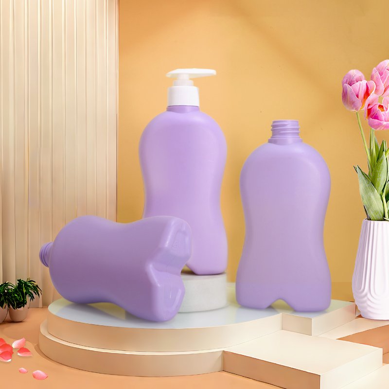
Color is the fastest signal a package sends. In beauty it encodes category, efficacy and price tier before the shopper reads the name. Choose color by category convention and target market, then control it in production with a Pantone reference, an approved master sample and a Delta E tolerance of 1.5 or below.
Most brands treat color as the final design flourish. In practice it is a technical specification with a psychological brief attached. This guide covers what colors signal in beauty, how meaning shifts between markets, how resin choice changes the result, and how to keep the shade stable from first article to the twentieth batch.
Color specification at a glance
- Speed of judgement: a widely cited 2006 study in Management Decision found shoppers assess a product within 90 seconds, with 62–90% of that assessment driven by color alone.
- Production tolerance: ΔE*ab of 1.5 or below against the approved master sample; below 1.0 is generally imperceptible.
- Coloring routes: masterbatch in-resin, spray coating, shrink sleeve or label - each with different cost and MOQ behaviour.
- Regulatory note: EU Directive 94/62/EC limits the sum of lead, cadmium, mercury and hexavalent chromium in packaging to 100 ppm; US state Toxics in Packaging laws mirror this.
- Light protection: opaque and amber-tinted packs shield light-sensitive actives; clear PET offers none without an additive or secondary carton.
- ShiJin: 1,000+ open molds, MOQ 5,000 units, 15–25 day production, custom masterbatch color matching to Pantone reference.
Why Does Color Decide the First Impression?
Color is processed faster than shape, and far faster than text. On a crowded shelf or in a grid of e-commerce thumbnails, it is the only attribute that registers before the shopper has decided to look properly.
A frequently cited 2006 paper by Satyendra Singh in Management Decision reported that people form a judgement about a product within 90 seconds, and that between 62% and 90% of that assessment rests on color alone. The figure is often repeated loosely, but the underlying point holds: color arrives first and frames everything after it.
For beauty packaging this has three consequences:
- Color sets the category expectation. A shopper decides whether a bottle is skincare, haircare or cleaning before reading the label.
- Color sets the price expectation. Deep matte black and muted neutrals read as premium; bright saturated primaries read as value or as youth-targeted.
- Color must survive the thumbnail. A subtle gradient that looks refined in hand disappears at 200 pixels wide. Test your palette at thumbnail scale before approving it.
What Do Colors Signal in Beauty Categories?
These associations are conventions, not laws. Following them makes a product instantly legible. Breaking them deliberately can differentiate - but only if the rest of the pack explains why.
| Color | Common signal in beauty | Typical use |
|---|---|---|
| White / off-white | Clinical, pure, safe, dermatological | Sensitive skin, medical-adjacent skincare, basics |
| Black | Luxury, authority, technology | Prestige serums, men's grooming, professional haircare |
| Green | Natural, plant-derived, calming | Botanical and clean-beauty ranges, scalp care |
| Amber / brown | Apothecary, potency, light protection | Oils, retinol, vitamin-based actives |
| Pink / blush | Softness, femininity, youth | K-beauty, hydration, teen and young adult ranges |
| Blue | Hydration, cooling, trust | Moisturisers, aftershave, hyaluronic products |
| Gold / metallic | Indulgence, anti-ageing, richness | Premium creams, festive and gift editions |
| Clear / transparent | Honesty, simplicity, formula as hero | Toners, essences, minimalist ranges |
Two design decisions matter more than the hue itself. Saturation controls perceived price - desaturate a color and it reads more expensive. And finish controls perceived quality - the same shade in matte, soft-touch and high gloss produces three different price impressions from one masterbatch.
Does Color Meaning Change by Market?
Yes, and the differences are large enough to matter for exporters. If one pack ships to several regions, check the palette against each market rather than assuming a universal reading.
- White signals purity and clinical safety across most Western markets. In parts of East Asia it also carries funerary associations, so it is usually paired with a second colour or a metallic accent rather than used alone.
- Red reads as energy and boldness in Europe and North America, and as luck and celebration in Chinese-speaking markets, where it performs strongly for gift sets and Lunar New Year editions.
- Green is firmly the natural and eco code in most markets, and additionally carries religious significance in the Middle East, where it is treated respectfully.
- Purple reads as premium and anti-ageing in Western beauty, and is closely tied to blonde-toning haircare across most markets.
- Yellow signals brightness and vitamin C almost universally, but pale yellow can read as discolouration or degradation on a white cream, so pack and formula must be considered together.
Export tip: if a single SKU ships worldwide, keep the bottle neutral and carry market-specific colour on the label or sleeve. It preserves one mold and one masterbatch while letting the graphics localise.
How Does Bottle Material Change the Color?
The same Pantone reference produces visibly different results in different resins. This surprises brands more than any other part of the process.
PET
High clarity and a neutral base, so it reproduces tints and transparent colors most accurately. Ideal for jewel-tone translucents and for clear packs where the formula colour is part of the design.
PETG
The highest clarity of the three and excellent depth in thick-wall sections, which is why it dominates premium serum and dropper bottles. Colors appear richer because light travels further through the wall.
HDPE
Naturally translucent and slightly milky, so it cannot produce a true transparent color. Every HDPE bottle is effectively opaque or pearlescent. Pastels shift slightly warm against the natural base, so a physical match is essential rather than a screen approval.
Wall thickness compounds this. A 0.4 mm shoulder and a 1.2 mm base in the same translucent bottle will not read as the same colour. For deeper background on how these three resins differ, see our PET vs HDPE vs PETG comparison.
Masterbatch, Spray or Sleeve?
Three routes deliver colour, at very different costs and minimums.
| Method | How it works | Best for |
|---|---|---|
| Masterbatch (in-resin) | Pigment concentrate blended with resin before moulding | Lowest unit cost, colour cannot scratch off, ideal from 5,000 units |
| Spray coating | Colour sprayed onto a moulded bottle, then cured | Matte, soft-touch, gradient and metallic effects unavailable in resin |
| Frosting | Etched or coated translucent finish | Diffused premium look on clear PET or PETG |
| Shrink sleeve / label | Printed film applied after moulding | Multiple colourways from one clear bottle, small runs per variant |
The practical decision usually comes down to variant count. One colour across the range favours masterbatch. Six colourways at modest volume favour a single clear bottle with sleeves, because you keep one mold, one production run and one inventory item. Application methods and durability testing are covered in our guide to surface decoration and finishing.
How Do You Hold Color Across Batches?
Approving a colour is easy. Reproducing it eleven months later, on a different resin lot, is the real work. Five controls make it dependable.
- Approve a physical master sample, not a screen. Monitors, phone cameras and printed proofs all misrepresent plastic. Sign and date two retained samples - one for you, one for the factory.
- Provide a Pantone reference as the starting point, but treat the physical plastic chip as the contract.
- Set a numeric tolerance. ΔE*ab of 1.5 or below against the master is a realistic production limit for moulded plastic. Below 1.0 is generally imperceptible; above 2.0 is visible side by side.
- Fix the viewing conditions. Specify D65 daylight in a light booth. Colours that match under one light and diverge under another indicate metamerism from a different pigment blend.
- Check first article every production run. Resin lots, regrind ratio and pigment batches all drift. A colour check belongs in the same first article inspection as dimensions - see our pre-shipment QC checklist.
One more caution for sustainability-focused ranges. Post-consumer recycled resin carries a grey or yellow cast that shifts every pastel. Approve the colour in the exact PCR grade and percentage you will run in production, never in virgin resin.
Writing a Color Brief That Survives Production
A complete brief prevents three rounds of samples. Include all six items:
- Pantone reference - solid coated or uncoated, stated explicitly.
- Physical target - a chip, a competitor pack or a previous bottle, posted to the factory.
- Resin and grade, including PCR percentage if applicable.
- Opacity requirement - transparent, translucent, pearlescent or fully opaque.
- Finish - gloss, matte, soft-touch or frosted.
- Tolerance and light source - for example ΔE ≤ 1.5 under D65.
Start from what already exists
Colour development is fastest when the shape is already tooled. Selecting a stock bottle from an existing mold library removes tooling cost and lead time from the equation, leaving colour as the only variable to approve.
At ShiJin we colour-match to Pantone reference across a library of 1,000+ open molds, in PET, HDPE and PETG, with MOQ from 5,000 units and 15–25 day production. Colour samples are produced in the actual resin grade before mass production begins. For the shapes themselves, our 2026 design trends guide shows where silhouettes and palettes are heading.
Frequently Asked Questions
What color is best for skincare packaging?
There is no single best color, only the right code for your category and price tier. White and pale blue read clinical and hydrating, green signals botanical, amber suggests potency and light protection, and black or muted neutrals communicate luxury. Match the color to the promise your formula makes.
Can you match any Pantone color in a plastic bottle?
Most Pantone references can be matched closely with custom masterbatch, but exact reproduction depends on the resin. HDPE has a translucent milky base that shifts pastels warm and cannot produce true transparent colors. PET and PETG reproduce tints far more faithfully. Always approve a physical plastic sample rather than a screen.
What is an acceptable color tolerance for plastic packaging?
Delta E*ab of 1.5 or below against the approved master sample is a workable production tolerance for moulded plastic. Below 1.0 the difference is generally imperceptible to the eye, and above 2.0 it becomes visible when two units sit side by side. Specify the viewing light source, normally D65, alongside the number.
Does recycled PCR resin affect packaging color?
Yes. Post-consumer recycled resin carries a grey or yellow cast that becomes obvious in pale and pastel shades, and the cast varies between lots. Approve your color in the exact PCR grade and percentage you intend to run, and widen the tolerance slightly compared with virgin resin.
Should I use colored bottles or clear bottles with labels?
If you sell one or two variants at volume, in-resin masterbatch coloring gives the lowest unit cost and a finish that cannot scratch off. If you sell many colorways at modest volume per variant, a single clear bottle with printed shrink sleeves keeps you on one mold, one production run and one inventory item.
Matching bottle options for this topic
Real molds from our library in a comparable material and size class — each product page carries the full spec sheet, neck size, MOQ and lead time.
- PET Cosmetic Bottle 150ml — SKU SJT0101-150
- PET Cosmetic Bottle 250ml — SKU SJT0050-250
- PET Cosmetic Bottle 300ml — SKU SJT0591-300
- PET Cosmetic Bottle 750ml — SKU SJT0075-750
Have a Pantone reference and no bottle yet?
Send us your color target and resin preference. We will produce a physical color sample in the actual grade, from a stock mold, before you commit to a production run.
Browse Mold Library Request a Quote