
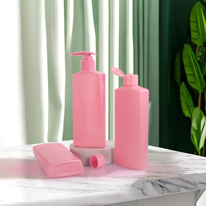
Specifying colour on a cosmetic bottle means choosing a Pantone reference, defining an acceptable Delta E tolerance, choosing a measurement standard (D65, D50, A or F-series), and writing an acceptance protocol that covers substrate, finish and lighting. Without all four, two production runs of the same colour will look different on the shelf.
Pantone is a colour matching system, not a colour measurement system. It tells you what a colour should look like on a printed chip or a coated card. It does not, on its own, tell you how close a blow-moulded PET or HDPE bottle must get before it counts as a match. To turn Pantone into a manufacturing spec, brands need Delta E, a measurement system that quantifies colour difference in a number, plus a sampling protocol and a lighting condition. This guide explains how Delta E is calculated, what tolerance values are realistic for cosmetic packaging, how substrate colour affects the outcome, and how to put it all on a PO.
Pantone matching at a glance
- What Pantone is: A proprietary colour matching system with standard references like Pantone 18-3838 TCX or Pantone Cool Gray 7C. Used as the brand reference, not the production spec.
- What Delta E is: A numerical colour difference calculated in CIE Lab space. Delta E 1.0 is just noticeable to the trained eye; Delta E 3.0 is the typical cosmetic packaging tolerance.
- Delta E formulas: Delta E 76 (original), Delta E 94 (graphic arts), Delta E 2000 (perceptually uniform). Modern specs use Delta E 2000 or CMC for plastic parts.
- Standard illuminants: D65 (average daylight, used in most QC), D50 (graphic arts and print), A (incandescent), F-series (fluorescent). Always specify which illuminant.
- Substrate effect: The same masterbatch batch reads different on clear PET, white HDPE and PETG because the resin colour and surface gloss contribute to the final colour.
- ShiJin: 1,000+ open molds in PET, HDPE and PETG; MOQ 5,000 units. We match masterbatch colour to Pantone references under Delta E 2000 tolerance, with spectrophotometer readings recorded on every production batch.
Why Pantone Is Not Enough
Pantone is a colour reference library. A designer picks a Pantone chip because it is the brand colour, and they communicate it to the supplier as 'Pantone 18-1664 TCX' or 'Pantone Cool Gray 7C'. The supplier is expected to produce a bottle that looks like that chip.
The chip is printed on coated or uncoated paper, with controlled ink density, on a flat substrate. The bottle is blow-moulded plastic with a curved surface, gloss or matte finish, and a masterbatch tinted throughout the resin. The two surfaces reflect light differently. Even a perfect match against the chip will look slightly different to the eye on the shelf.
To make Pantone into a working spec, brands need a quantitative tolerance that both sides can measure. That tolerance is built on CIE Lab colour coordinates and Delta E. Without it, every batch is judged subjectively, and every batch is disputed.
What Is Delta E and How Is It Calculated?
Delta E, written dE or ΔE, is the Euclidean distance between two colours in CIE Lab space. CIE Lab was designed to be perceptually uniform, meaning equal numerical differences in Lab space correspond roughly to equal perceived differences by the human eye. Delta E is the numerical measure of that difference.
The classic formula is Delta E 76. It simply measures the straight-line distance between two colours in Lab space and is easy to calculate, but it does not weight lightness, chroma and hue differences the same way the eye does. Delta E 94 added weighting factors. Delta E 2000 added corrections for blue and for low-chroma colours and is now the most perceptually accurate general-purpose formula. CMC is an alternative commonly used in the textile industry.
Delta E values are interpreted as follows. Delta E under 1.0 is not visible to most observers. Delta E 1.0 to 2.0 is visible to trained eyes under controlled lighting. Delta E 2.0 to 3.5 is acceptable for most cosmetic packaging. Delta E 3.5 to 5.0 is acceptable for non-critical parts and secondary packaging. Delta E above 5.0 is usually rejected.
Which Lighting Condition Should You Specify?
A colour sample looks different under daylight, under office fluorescents and under shop lighting. The same bottle can pass under D65 and fail under warm white. To eliminate this, every colour measurement and visual approval must specify the illuminant.
D65 is average northern daylight at 6500K and is the standard illuminant for most plastic QC. D50 is 5000K and is the standard for graphic arts, so it is used when the bottle must match printed cartons and labels. A is incandescent lighting at 2856K and is rarely used for cosmetics. F-series simulates fluorescents and is sometimes used for store-mimicking QC.
The standard observer angle is also important. The CIE 1931 2-degree observer is the legacy standard; the CIE 1964 10-degree observer is more representative of how humans actually see colour and is increasingly preferred. Specify both the illuminant and the observer in the colour spec.
How Does Substrate Affect Colour Match?
Masterbatch colour does not survive contact with the resin unchanged. Clear PET, white HDPE and PETG each have a base resin colour and a base gloss that interact with the masterbatch pigment. The same masterbatch loading can read slightly differently on each substrate.
Surface finish changes the result too. A high-gloss bottle reflects more light back at the observer, so the colour reads lighter and more saturated. A matte or frosted bottle scatters the light and reads slightly more muted. Two production runs of the same colour can fall outside tolerance if the surface finish drifts.
Bottle geometry matters. A flat panel reads differently from a curved shoulder. A wall thickness change of 0.3 mm can shift the apparent colour noticeably. Specifying colour on a curved bottle requires measurement at a defined geometry and against a defined standard, typically a 2-3 mm thick plaque of the same resin and masterbatch. Our lightweighting guide explains how wall thickness reductions affect more than just material cost.
What Delta E Tolerance Is Realistic?
For cosmetic bottles, the typical Delta E 2000 tolerance is 2.0 to 3.0 against the master standard, measured on a plaque or a defined panel of the actual bottle. Tighter tolerances of Delta E 1.0 to 1.5 are achievable but expensive, and require tight control of masterbatch loading, resin batch and processing conditions.
Looser tolerances of Delta E 3.5 to 5.0 are acceptable for secondary packaging, for outer cartons, and for components that are partly covered by a label or a closure. A pump that disappears into a closure does not need the same colour control as a stand-alone bottle.
Tolerance should also be defined as a per-component delta. Colour drift between two bottles in the same shipment should be lower than drift from one production batch to the next. A good spec defines Delta E for bottle-to-bottle within a batch (Delta E 1.0 to 1.5), bottle-to-bottle batch-to-batch (Delta E 2.0 to 3.0) and Pantone-to-batch (Delta E 2.5 to 3.5). Our masterbatch versus pre-coloured resin guide explains the choice behind each approach.
How Do You Approve a Colour Sample?
Approval starts with a master standard, usually a production part or a plaque kept by the brand or the supplier. The supplier sends a pre-production sample made from the same resin, masterbatch and process planned for production. The brand measures Delta E against the master standard under the specified illuminant and observer.
Visual inspection is still important. Delta E tells you the numerical difference, not whether the difference is acceptable to the brand. A small Delta E in hue can be more objectionable than a larger Delta E in lightness, depending on the colour. A trained colourist reviews the sample under D65 or D50 in a light booth, ideally a Macbeth Judge or equivalent.
Approval is per-batch. Once production starts, a first-article inspection is followed by in-process checks at defined intervals, typically every 2 to 4 hours, and a retain sample is held for the life of the product. Our sample approval workflow guide walks through the full sequence.
How Do You Specify Colour on a PO?
A colour spec on a PO should include: the Pantone reference, the resin and masterbatch approach, the substrate and finish (for example, clear PET high gloss), the Delta E formula (Delta E 2000), the illuminant (D65) and observer (10-degree), the tolerance (Delta E 2.5 against master standard), and the approval protocol (pre-production sample, retain sample, in-process check frequency).
Example spec for a 200ml clear PET pink bottle: 'Pantone 18-1764 TCX, masterbatch, PET high gloss finish, dE2000 2.5 max against master plaque under D65/10°, pre-production sample required, retain samples retained for 36 months'.
At ShiJin we can match Pantone references to our PET, HDPE and PETG bottles with spectrophotometer readings recorded for every production batch. Send your Pantone chip, your resin and finish preference, and your Delta E tolerance, and we will return a measured plaque for approval before production, with MOQ from 5,000 units and 15-25 day lead times.
Frequently Asked Questions
What is Delta E in cosmetic packaging?
Delta E is the numerical distance between two colours in CIE Lab space. It tells you how different two colours are in a number. Delta E under 1.0 is invisible to most observers; Delta E 2.0 to 3.5 is the typical cosmetic packaging tolerance.
Which Delta E formula should I use?
Use Delta E 2000 for most cosmetic bottles. It is the most perceptually accurate of the standard formulas and is widely supported by spectrophotometers and QC systems.
What lighting should colour be measured under?
Specify D65 for most plastic QC. Use D50 when the bottle colour must match printed cartons and labels. Always specify the illuminant and the standard observer angle, typically 10-degree.
Does the same masterbatch match on every resin?
No. The same masterbatch reads slightly differently on clear PET, white HDPE and PETG because each resin has its own base colour and surface gloss. The colour should be matched on the actual resin and finish used.
How tight can a Delta E tolerance be?
Tighter than Delta E 1.0 is rarely achievable on production bottles. Delta E 2.0 to 3.0 is realistic and cost-effective. Delta E 1.0 to 1.5 is achievable with tight process control but adds cost.
Matching bottle options for this topic
Real molds from our library in a comparable material and size class — each product page carries the full spec sheet, neck size, MOQ and lead time.
- PET Cosmetic Bottle 150ml — SKU SJT0556-150
- PET Cosmetic Bottle 250ml — SKU SJT0121-250
- PET Cosmetic Bottle 400ml — SKU SJT0143-400
- PET Cosmetic Bottle 500ml — SKU SJT0459-500
Need Pantone-matched colour on a bottle?
Send us your Pantone reference, your resin and finish preference, and your Delta E tolerance. We will provide a pre-production sample measured against your master standard, with spectrophotometer data on every batch, from 1,000+ open molds, MOQ 5,000 units and 15-25 day lead times.
Browse Mold Library Request a Quote